A blurry PDF stamp is rarely caused by one single problem. In most cases, it comes from a low-resolution seal image, aggressive scaling, a white-background screenshot, page rotation, PDF preview zoom, or export compression. Before blaming the stamping tool, teams should check the source image, placement size, page layout, and the final PDF at 100% zoom.
I. Why Blurry Stamps Become a Real Workflow Problem
A stamp does not have to be decorative. In many office workflows, it tells the reader that a file was received, reviewed, approved, archived, paid, or prepared for internal circulation. If the stamp is hard to read, the document may still be usable, but the workflow becomes less reliable.
The most frustrating part is that a seal image can look fine on your desktop, but appear soft after being placed on a PDF. Sometimes it looks sharp in the browser preview and blurry after export. Sometimes it is sharp at 100% zoom, but looks terrible when printed. These differences are normal, because PDF rendering involves page size, image resolution, scaling, compression, and viewer behavior.
II. The Usual Suspect: A Low-Resolution Source Image
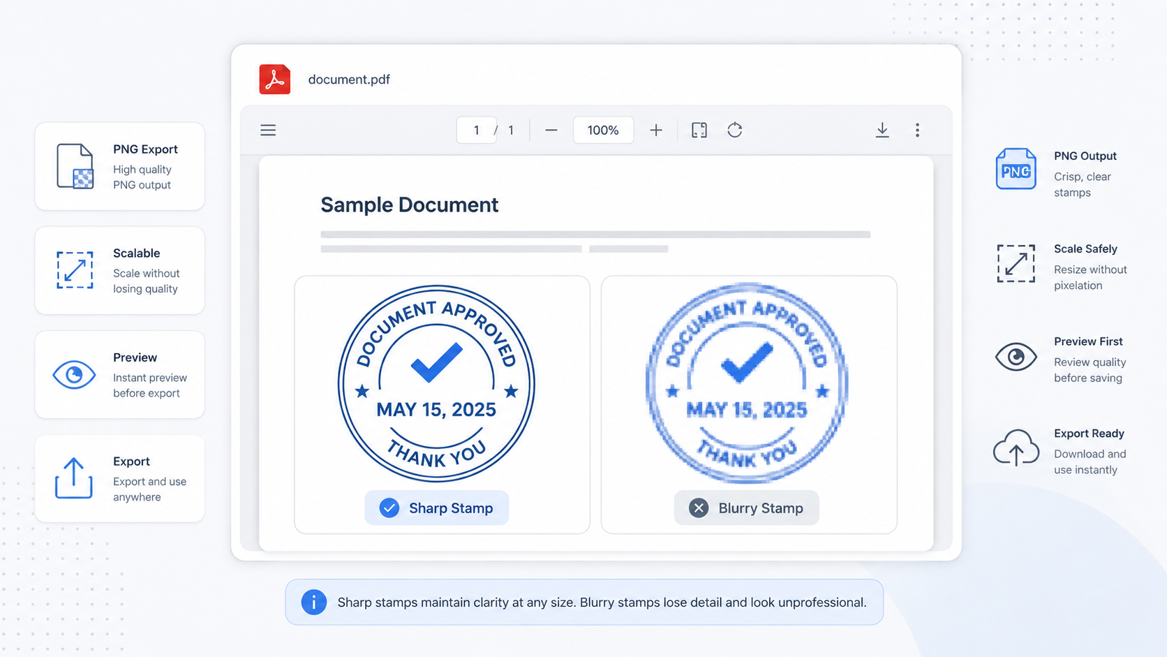
Most blurry stamps start with the image file. If the original stamp is a tiny screenshot, a compressed JPG, or a photo taken from a phone, the PDF tool cannot recover detail that is not there. It can only scale the image, and scaling a weak image usually makes the problem more visible.
III. Scaling: The Hidden Cause Most People Miss
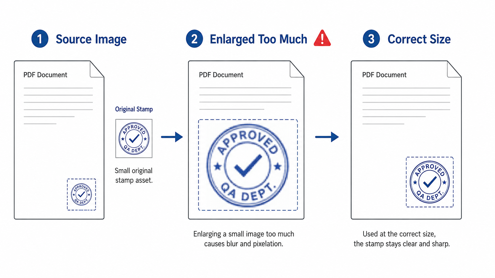
Even a decent stamp image can become blurry if it is enlarged too much. A 300 px seal placed as a large 70 mm stamp has to stretch. The edges become soft because the viewer is trying to invent missing pixels.
The opposite can also cause trouble. If a huge image is placed as a tiny mark, the PDF tool or viewer may downsample it. Downsampling is not always bad, but it can blur thin strokes, small text, and fine circular seal lines.
💡 Simple placement rule:
- Start with a clean PNG that is larger than the final display size.
- Do not enlarge small images beyond their natural detail.
- Preview the exported PDF at 100%, not only at browser-fit width.
- Print one test page if the final file will be printed or scanned again.
IV. PNG, JPG, and Signature Images: Which Format Works Better?
| Format | Best for | Advantages | Common problem |
|---|---|---|---|
| Transparent PNG | Company seals, approval stamps, signature images | Clean transparency and sharp edges | Large files if exported carelessly |
| JPG | Photos and scanned backgrounds | Small file size | No transparency, compression artifacts |
| Screenshot | Temporary notes or examples | Fast to create | Often blurry when reused as a stamp |
| Vector source | Original logo or seal design | Scales cleanly before export | Must be exported properly before PDF stamping |
V. Page Rotation and PDF Coordinates Can Shift the Result
Some PDFs look normal on screen but have hidden rotation metadata. A page may appear upright in the viewer while the internal coordinate system is rotated. When stamps are placed across multiple pages, this can lead to unexpected positions, inconsistent scaling, or marks that look slightly off.
Mixed page sizes can create a similar issue. A file may contain A4 pages, Letter pages, landscape pages, scanned pages, and appendix pages in one document. If the same stamp size is applied everywhere, it may feel visually inconsistent.
- Check whether all pages share the same size.
- Look for landscape pages inside portrait documents.
- Preview the first, middle, and last page.
- Inspect appendices separately.
- The stamp is sharp on page one but soft on scanned appendices.
- The mark appears in different corners across pages.
- Landscape pages crop or stretch the seal.
- Printed output looks worse than screen preview.
VI. The 100% Preview Check
☐ Set zoom to 100%. Fit-to-width can hide small defects.
☐ Check stamp edges. Look for pixelation, halos, white boxes, or jagged circles.
☐ Check nearby text. Make sure the stamp does not cover clause numbers, dates, totals, names, or signature lines.
☐ Check multiple pages. Review pages with different sizes, rotations, and scanned content.
☐ Print one page if needed. Screen sharpness and print sharpness are not always the same.
☐ Save the original asset. Keep the clean PNG separate from the stamped PDF output.
VII. Where PDF SealBox Fits
PDF SealBox is designed for visible PDF stamping tasks such as approval marks, received stamps, transparent PNG seal images, signature graphics, selected-page stamping, all-page stamping, and cross-page seals. For common browser-based stamping tasks, the workflow is designed to process files locally whenever possible.
Good stamp quality still depends on the asset you provide. A clean transparent PNG, careful placement, and a final 100% output review will usually solve more problems than repeatedly changing tools.
FAQ
Key Takeaways
- Most blurry PDF stamps start with weak source images or aggressive scaling.
- Transparent PNG is usually the best format for seals and signature graphics.
- Always inspect the exported PDF at 100% zoom before sending it.
- Mixed page sizes and hidden rotation can change how stamps appear across pages.
- A sharp visible stamp improves presentation, but it is not a digital signature.